
Chheda's Western Snacks' Collection -
Packaging Design
My Graduation project. This project is a live-industry project that is still under production, and I was given the opportunity to work on it. The Mumbai-Based snacks company Chheda's is introducing a range of western snacks, for now Five, and I had developed concepts for each of the packaging. You can see the final concept and its execution here, the full process.


LIGHTS

LIGHTS

LIGHTS


01. Roasted Fun Curls - Gigabytes
Initial Sketches


Concept Note and Sketch
The name Gigabytes feels bold and oversized, echoing the snack’s round, chunky, puffy presence. The visual mirrors this energy, with inflated, rounded typography, melty cheese-like details, and floating puffs that suggest a light, airy bite. Warm orange tones keep it comforting and snacky, capturing a soft, playful world of cheesy, melt-in-mouth joy. Together, they form the silhouette of a wide, exaggerated mouth, playful yet poised mid-bite.


Final Design - Gigabytes


02. Potato Corn Stix - Zaps
Initial Sketches


Concept Note and Sketch
ZAPS carries the idea of instant impact. Each bite feels like a sudden jolt; sharp, electric, and impossible to ignore. The visual world draws from the language of lightning, bold, striking, and alive with movement, infused with a punchy, comic-book energy, capturing a surge of flavour that sparks the senses and keeps you buzzing.

Final Design - Zaps


03. Rice Crispies - Khattack
Initial Sketches


Concept Note and Sketch
It begins like a burst that can’t be contained. It pushes forward, sending sticks and sharp lines outward, echoing the spice, crunch, and playful intensity within. The impact is bold and hard to ignore, capturing that first bite where the crunch doesn’t just happen, it resonates.

Final Design - Khattack


04. Cream-Filled Snax - Stuffins
Initial Sketches


Concept Note and Sketch
We see Checkered patterns everywhere. Vibrant tablecloths, baking papers, comfy cushions and blankets, or a late night game of chess. And the one thing that all of these have in common, is the feeling of relaxation, comfort, and leisure time. Building further on this concept, this route explores Stuffins’ as a comfort-snack which one can have anytime. The snack has a cushion-y shape, therefore the checkered pattern can be integrated well into the packaging.

Final Design - Stuffins


05. Triangle Chips - Cut-2-Cut
Initial Sketches


Concept Note and Sketch
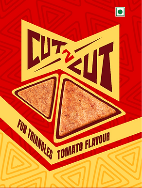
The name Cut-2-Cut Suggests tightly arranged. Since this is a triangular snack, which fits perfectly when multiple are laid out together, this route explores the TYPE-focused approach, shaped like triangles.

Final Design - Cut-2-Cut



FINAL RENDERS
(with & without Logo)


